

Angular Material library comes with many cool pre-built themes. However, do you know that it is very easy to create a new custom theme in just under 2 minutes. Yep its that simple and you only need to create one file for this.
Pre-requisites
Angular Project built with Angular Material.
Step 1: Create a new file in the assets folder, lets call it custom-theme.scss. This file will be your custom theme file.
Step 2: Import Material Angular core theming functionality inside your custom theme file.
@import '~@angular/material/theming';Step 3: Render the styles which are theme independent. These styles need to be included only once in the application. It is better to include in the theme file so that you don’t have to include multiple style files in your app.
@include mat-core();Step 4: Define the color palettes that you will be using throughout in your theme. This is one of the main reasons that we are defining a custom theme file because we want to define our own colors.
$candy-app-primary: mat-palette($mat-indigo);
$candy-app-accent:  mat-palette($mat-indigo, A200, A100, A400);
$candy-app-warn:    mat-palette($mat-red);
Step 5: Create the theme object from your color palettes defined earlier.
$candy-app-theme: mat-light-theme($candy-app-primary, $candy-app-accent, $candy-app-warn);Step 6: Apply these color to all Angular Material components. In this step you will pass your theme object create in previous step to a sass mixin that will send your theme colors to all Angular Material components.
@include angular-material-theme($candy-app-theme);Step 7: Add the theme file to the styles array under angular.json.
"styles": [
   "src/assets/custom-theme.scss",
   "src/styles.scss"
 ],
That’s it! Now run the app and see your components rendered beautifully with your own custom theme.
Here is a before and after result on the Slider component.
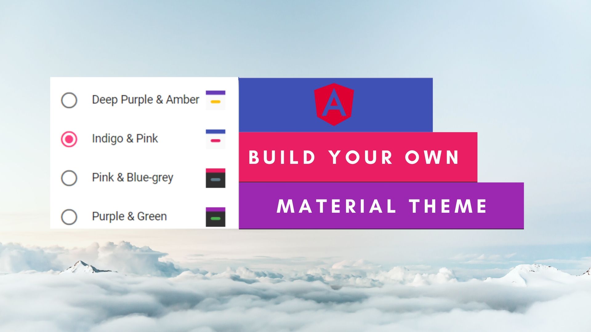
Before: Theme used Indigo-pink

After: Theme used Custom-theme
